Featured Case Studies

Website: Most Improved
2024 Crystal Awards Finalist
Wofsey, Rosen, Kweskin & Kuriansky, LLP, a law firm established in 1915, needed to modernize its outdated website to reflect its reputation for sophistication, advocacy, and excellence. The 15-year-old site lacked a contact form, engaging content, and modern visuals, leaving potential clients with little to connect to the firm’s century-long legacy. The goal was to create a website that honored the firm’s history, showcased its attorneys’ individual achievements, and appealed to its diverse client base of individuals and businesses.
I led the website redesign process, incorporating modern design principles while highlighting the firm’s unique values and reputation. Key contributions included:
Creating a clean, minimalist design with white space and sans-serif fonts to convey professionalism and forward-thinking.
Developing an interactive homepage with dedicated paths for individual and business clients, simplifying navigation and increasing usability.
Showcasing attorneys as the cornerstone of the firm’s brand through updated headshots and a dynamic grid design on the homepage and lawyer directory pages.
Integrating the firm’s new logo and branding elements consistently throughout the website.
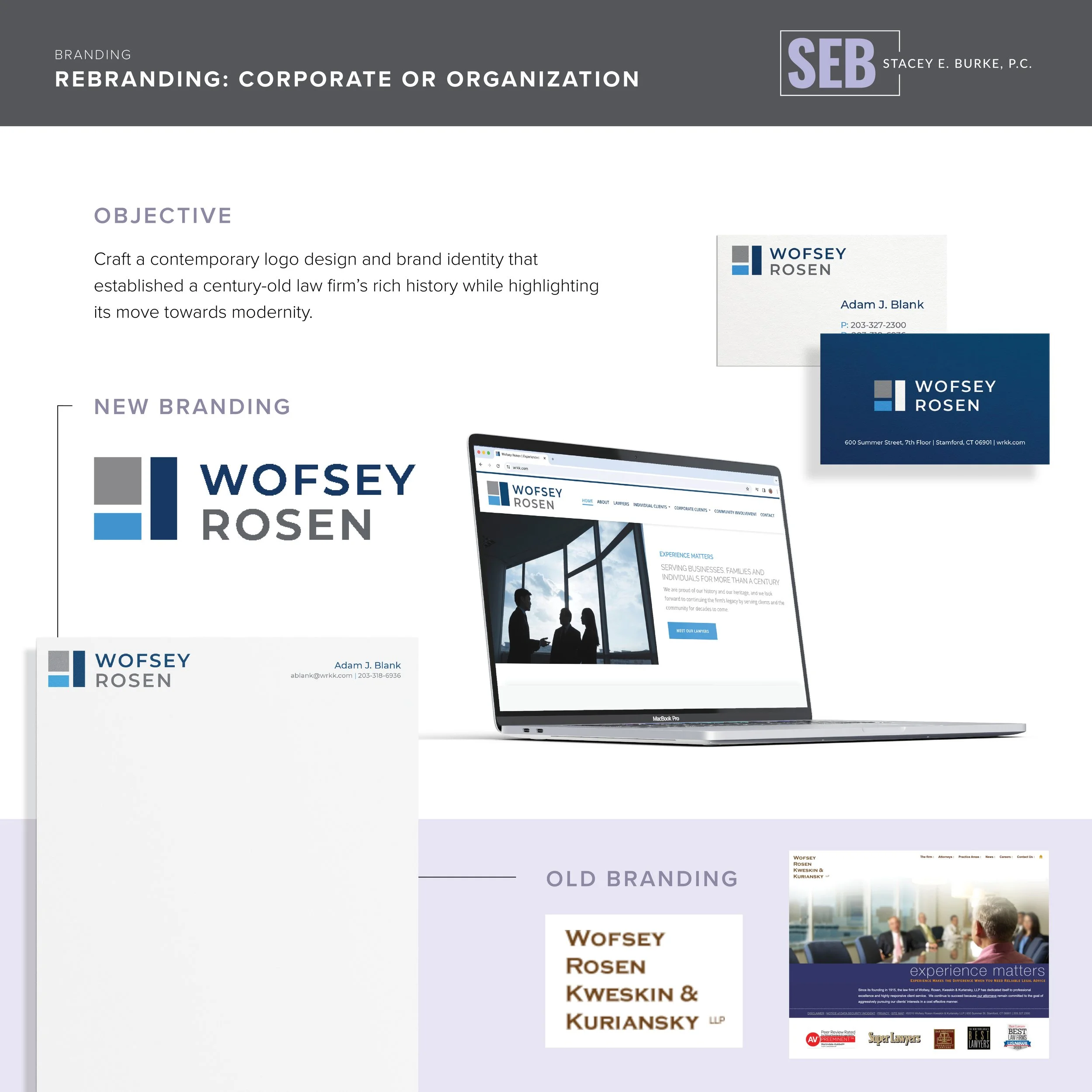
Branding: Corporate Rebrand
2024 Crystal Awards Finalist
Wofsey, Rosen, Kweskin & Kuriansky, LLP, a law firm established in 1915, sought to modernize its outdated brand to maintain dominance in a competitive market. The firm’s logo was dated, the name was lengthy and difficult to pronounce, and its 15-year-old website failed to reflect the firm’s legacy of excellence and forward-thinking values. The objective was to refresh the firm’s identity to reflect its rich history while positioning it as a contemporary, innovative leader.
To accomplish this, I distilled their core attributes—stability, excellence, and deep community ties—into a modern, strategic branding approach.
Designed a logo incorporating geometric elements symbolizing a strong foundation and steady growth, paired with a sans-serif font for modern gravitas.
Developed a cohesive brand identity, including a redesigned website, business cards, letterhead, email signatures, and social media visuals.
The rebrand received praise from clients and peers alike, significantly enhancing the firm’s market presence. The new website experienced a sharp increase in organic traffic and conversions, demonstrating the success of the updated messaging and design. This project reestablished Wofsey Rosen as both a trusted community pillar and a forward-thinking legal partner.
2023 Crystal Awards Finalist
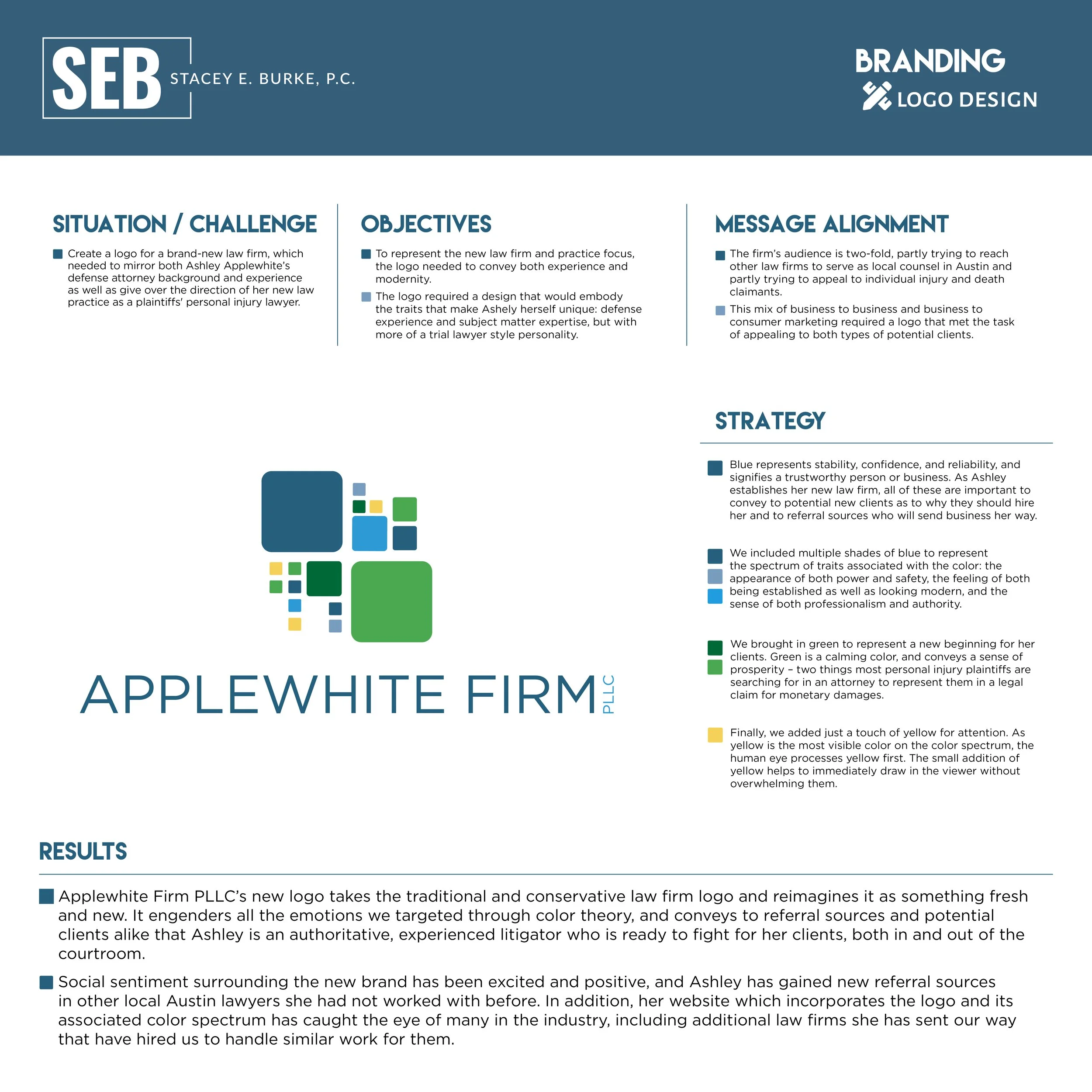
Branding: Logo Design
To represent her new personal injury law firm, Ashley Applewhite’s logo needed to convey both experience and modernity. The logo required a design that would embody the traits that make Ashely herself unique: defense experience and subject matter expertise, but with more of a trial lawyer style personality.
I analyzed color theory in order to develop the logo, utilizing colors that represent characteristics of both the new law firm entity and Ashley herself.
First, I focused on which traits we wanted to showcase to potential new clients. The majority of these traits were encompassed in the color blue. Blue represents stability, confidence, and reliability, and signifies a trustworthy person or business. Next, I focused on the clients and what they would be feeling in the moment of searching for an attorney. Most people engaging a personal injury attorney have gone through a traumatic event; I therefore brought in green to represent a new beginning for her clients. Green is also a calming color, and conveys a sense of prosperity – two things most personal injury plaintiffs are searching for in an attorney to represent them in a legal claim for monetary damages.
Finally, I added just a touch of yellow for attention. As yellow is the most visible color on the color spectrum, the human eye processes yellow first. The small addition of yellow helps to immediately draw in the viewer without overwhelming them.

Print Collateral: B2B Marketing
2019 Crystal Awards Winner
MehaffyWeber was invited to pitch as new legal representation to Caterpillar. Before the meeting, the law firm wanted to provide Caterpillar executives with a marketing piece showcasing the firm’s long history of success, one of the attorney’s previous experience representing the company, and other pertinent background information.
Because the brochure was created specifically for Caterpillar, I was able to make a hyper-specialized marketing piece utilizing Caterpillar’s colors, brand standards, equipment, and more. Based on Caterpillar’s own product catalogues, I designed a two-page spread showcasing all of the products for which the attorneys had handled legal matters over the years and utilized photos of said equipment to create a visual story. By designing a brochure in Caterpillar’s brand standards, the coloring, branding, and imagery of the marketing piece was familiar to the executives who would be receiving it.
MehaffyWeber was engaged by Caterpillar to serve as defense counsel for at least three cases in Texas, with several additional cases pending.
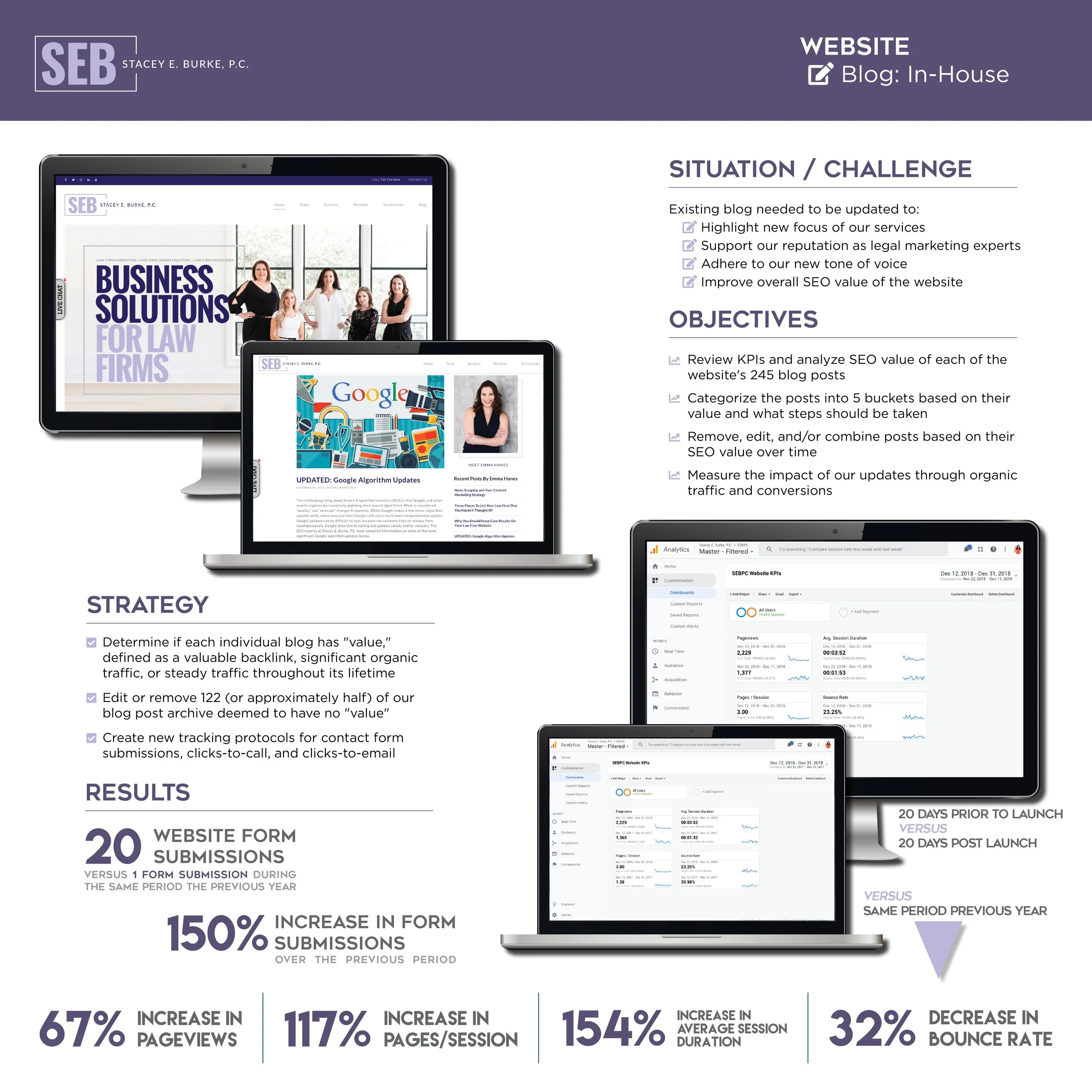
Website: Blog Content Analysis
2019 Crystal Awards Finalist
Stacey E. Burke, P.C. (SEBPC) is a marketing agency that focuses on providing digital marketing services for the legal industry. The blog needed to be updated to highlight the true focus of services offered, support our reputation as experts, adhere to our new tone of voice, and improve the overall search engine optimization (SEO) value of the website.
There were 245 blog posts on the website that needed to be analyzed to determine if they were adding value or taking away value. I examined each individual blog, looking at specific SEO data, including backlinks, content quality, keyword density, and relevancy. I measured the quality of each blog post by examining its length, readability, formatting (e.g. the utilization of headers), and tone. Blog posts that provided no value or were no longer relevant needed to be removed, while some blog posts needed to be updated or combined to create more comprehensive and thorough content.
The website experienced an incredible improvement in engagement and conversions, with a 67% increase in pageviews, a 117% increase in pages per session, a 154% increase in average session duration, and a 32% improvement in the bounce rate when compared to the same period in 2017.

2018 Crystal Awards Winner
Google Analytics Setup
When the website was originally launched, no conversion tracking was set up to measure and analyze conversions. Without conversion tracking data, it is impossible to not only measure success and return on investment, but also impossible to develop an understanding of website users and their intentions.
To establish conversion tracking protocols, I installed Google Tag Manager (GTM) on the website. With GTM, I created tags for certain events on the website, and specified when information about these events should be collected and sent to the website’s Google Analytics account.
The first step in setting up tracking protocols was specifying a naming system for each tag. After structuring the naming system, I created 13 separate tags and triggers: two call event tags, five email event tags, four v-card download event tags, and two contact form submission tags. I then set up each event as a Goal Conversion in Google Analytics.
The implementation of conversion tracking allowed us to identify the most successful website pages, and make updates and revisions accordingly in crease overall conversions on the website.